
Understanding The What Is a Trend Line?
Contents
In the world of data analysis and visualization, there’s a powerful tool that serves as the backbone for understanding trends, patterns, and relationships within datasets – the trend line. Whether you’re crunching numbers for business insights, scientific research, or simply trying to make sense of your personal finances, grasping the concept of a trend/line can significantly enhance your ability to interpret and draw meaningful conclusions from your data.

Defining the Trend/Line
At its core, a trend/line is a straight or curved line that visually represents the direction, trajectory, or tendency of a dataset. Picture it as a guiding path amidst a sea of scattered data points, helping you discern the overall pattern or trend lurking beneath the surface. While trend lines are commonly used in line charts, they can also be applied to scatter plots, bar charts, and other types of graphs to reveal underlying trends.
Unraveling Data Patterns
So, why exactly are trend/lines so crucial in the realm of data analysis? Well, imagine you’re tracking monthly sales figures for your e-commerce business. Without a trend/line, you might struggle to pinpoint whether your sales are steadily increasing, plateauing, or experiencing fluctuations over time. However, by overlaying a trend line onto your sales data, you can quickly discern whether there’s a clear upward or downward trajectory, enabling you to make informed decisions about marketing strategies, inventory management, and overall business growth.
Types of Trend/Lines
Trend/lines come in various flavors, each suited to different types of data and analytical objectives:
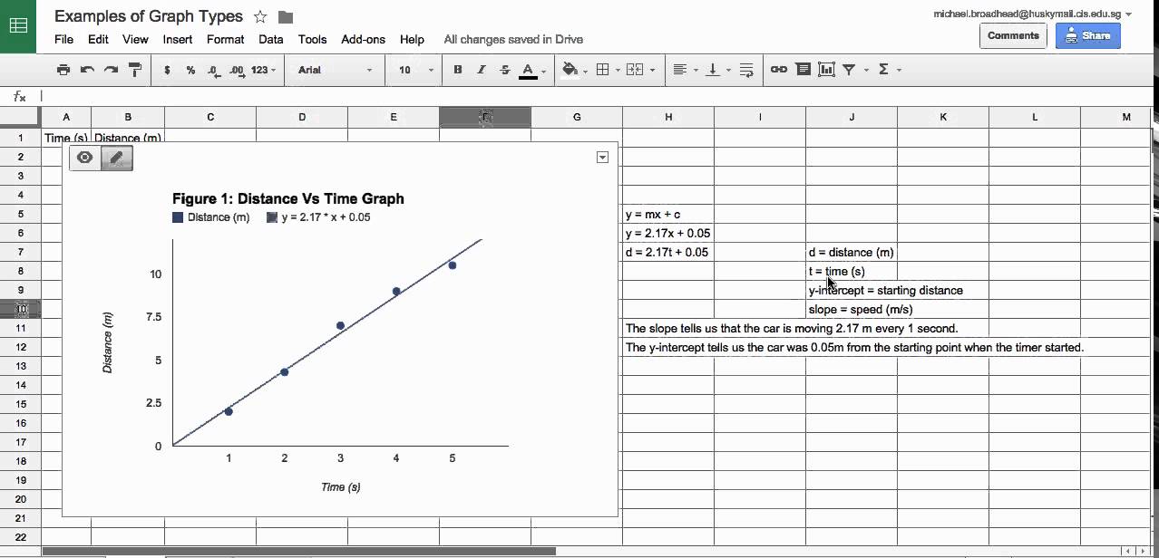
- Linear Trend/Lines: These are straight lines that fit linear data, where the relationship between variables can be described by a simple linear equation (e.g., y = mx + b). Linear trend lines are ideal for showcasing steady growth or decline over time.
- Exponential Trend/Lines: When your data exhibits exponential growth or decay, exponential trend lines can help visualize this nonlinear relationship. Think of compound interest, population growth, or the spread of a viral outbreak – scenarios where values increase or decrease at an accelerating rate.
- Polynomial Trend/Lines: Sometimes, your data might follow a more complex pattern that can’t be adequately captured by a straight line. Enter polynomial trend lines, which use polynomial equations to fit curves to your data. These trend lines can flexibly adapt to various shapes and nuances within your dataset.
Interpreting Trend/Lines
Once you’ve added a trend line to your chart, interpreting its significance is key to extracting actionable insights from your data. Here are a few things to consider:
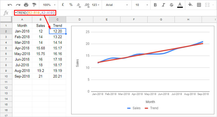
- Direction: Is the trend line sloping upward, downward, or relatively flat? The direction of the trend line indicates whether your data is trending positively, negatively, or remaining stable over time.
- Steepness: The steepness of the trend line provides clues about the rate of change within your dataset. A steep incline suggests rapid growth or decline, while a gentle slope indicates slower, more gradual changes.
- Accuracy: While trend lines offer valuable insights, it’s essential to remember that they’re simplifications of complex data. Therefore, it’s crucial to assess the accuracy and reliability of your trend line by considering factors such as data quality, sample size, and the validity of underlying assumptions.
How to Add a Trend Line in Google Sheets A Step-by-Step Guide
In today’s data-driven world, visualizing trends is crucial for making informed decisions. Whether you’re analyzing sales figures, tracking progress, or studying patterns, Google Sheets offers a powerful toolset to help you visualize data effectively. One such tool is the ability to add trend lines, which can provide valuable insights into the direction of your data over time. If you’re new to Google Sheets or simply want to learn how to harness this feature, you’ve come to the right place. In this step-by-step guide, we’ll walk you through the process of adding a trend line to your Google Sheets charts.
1. Open Your Google Sheets Document First things first, fire up your web browser and head over to Google Sheets. If you haven’t already, log in to your Google account and open the spreadsheet containing the data you want to analyze.
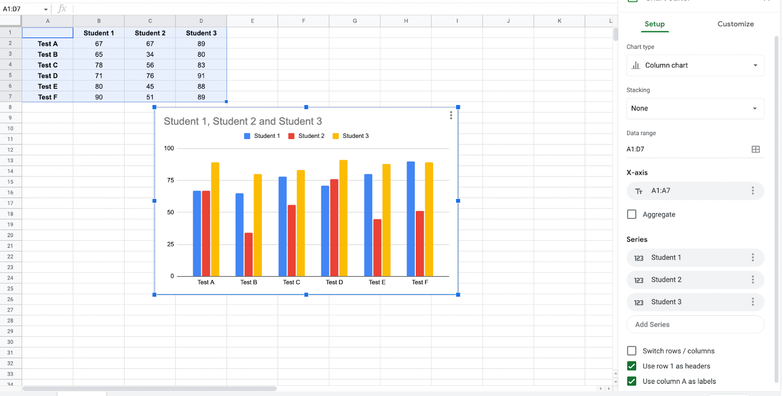
2. Select Your Data Once you’ve opened your spreadsheet, locate the data you want to visualize. tap and drag to select the range of cells containing your data points. Make sure to include both the x-values (independent variable) and y-values (dependent variable) for which you want to create the trend line.
3. Insert a Chart With your data selected, navigate to the top menu and tap on “Insert.” From the dropdown menu, select “Chart.” This will open the Chart Editor on the right side of your screen.
4. Choose Your Chart Type In the Chart Editor, you’ll see various options for chart types. Choose the type of chart that suits your data. For example, if you’re working with a set of data points over time, a line chart might be most appropriate.
5. Customize Your Chart Once you’ve selected your chart type, you can customize it to fit your preferences. You can adjust the chart title, axis labels, colors, and more to make your visualization clear and visually appealing.
6. Add a Trend Line Now, here comes the exciting part – adding the trend line. In the Chart Editor, tap on the “Series” tab, which should display a list of your data series. Find the series for which you want to add the trend line and tap
on the three dots next to it. From the dropdown menu, select “Trendline.”
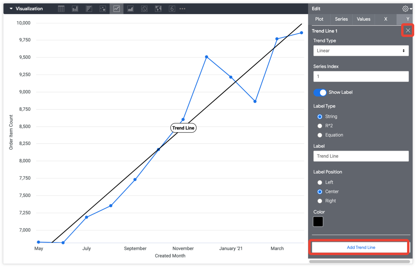
7. Customize Your Trend Line After adding the trend line, you can further customize it to suit your needs. You can choose different types of trend lines, such as linear, exponential, polynomial, or moving average, depending on the nature of your data. You can also adjust the line style, thickness, and color to make it stand out.
8. Analyze Your Trend Line Once you’ve added and customized your trend line, take a moment to analyze it. Does it slope upward, indicating positive growth? Or does it slope downward, suggesting a decline? Pay attention to the direction and steepness of the trend line, as these can provide valuable insights into the underlying trends in your data.
9. Fine-Tune Your Analysis Finally, don’t forget to fine-tune your analysis by exploring additional features and options in Google Sheets. You can add annotations, data labels, and error bars to enhance your visualization further. Experiment with different settings until you’re satisfied with the clarity and accuracy of your chart.
By following these simple steps, you can add a trend/line to your Google Sheets charts and gain deeper insights into your data. Whether you’re tracking business metrics, monitoring project progress, or conducting scientific research, trend lines can help you spot patterns, make predictions, and make informed decisions. So why wait? Start visualizing your data with trend lines today and unlock the power of data-driven insights!
Important TakeWay:
adding a (trend/line) in Google Sheets is a straightforward process that can help you understand your data better. By following the steps outlined in this guide, you can visualize trends, spot patterns, and make informed decisions based on your data. Whether you’re tracking sales, monitoring progress, or analyzing scientific data, trend lines provide valuable insights into the direction of your data over time. So don’t hesitate to experiment with trend lines in your Google Sheets charts and unlock the full potential of your data!
Recommended reading
How Can You Tell If A Non Friend Is Looking At Your Facebook Page
Artificial Intelligence (AI) : How Does It Work